Classification Metrics :
Confusion Matrix
| Actual (+) | Actual (-) | |
|---|---|---|
| Predicted (+) | TP | FP |
| Predicted (-) | FN | TN |
A confusion matrix shows the number of correct and incorrect predictions made by the classification model compared to the actual outcomes (target value) in the data
Misclassifications (notified on predicted value)
- False Positive = detected positive, wrongly
- False Negative = detected negative, wrongly
Precision
(aka PPV) Out of the total predicted positive how many are actually positive.
TP ÷ (TP + FP)
Recall
(aka Sensitivity) Percentage of actual positive predicted as positive.
TP ÷ (TP + FN)
| Actual (+) | Actual (-) | ||
|---|---|---|---|
| Predicted (+) | [^TP | FP] | [Precision] |
| Predicted (-) | ^FN | TN | |
| ^Recall |
Precision and Recall have an inverse relationship, if precision goes up, recall goes down.
- Medical Model : High Recall Model :: FN should be avoided
- Spam Model : High Precision Model :: FP should be avoided
F1 Score
The F1 score is a number between 0 and 1 and is the harmonic mean of precision and recall and is used when we want to have a model with both good precision and recall.
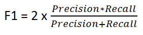
If you are a police inspector and you want to catch criminals, you want to be sure that the person you catch is a criminal (Precision) and you also want to capture as many criminals (Recall) as possible. The F1 score manages this tradeoff.
Beta Score Fβ (Range: 0 to ∞)
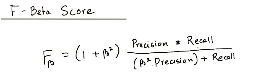
(Fβ=0) Precision …… F0.5 ……. F1 …….. F2 ……. Recall (Fβ=∞)
For other values of β, if they are close to 0, we get something close to precision, if they are large numbers, then we get something close to recall, and if β=1, then we get the harmonic mean of precision and recall.
For the spaceship model, we can’t really afford any malfunctioning parts, and it’s ok if we overcheck some of the parts that are working well. Therefore, this is a high recall model, so we associate it with beta = 2.
For the notifications model, since it’s free to send them, we won’t get harmed too much if we send them to more people than we need to. But we also shouldn’t overdo it, since it will annoy the users. We also would like to find as many interested users as we can. Thus, this is a model which should have a decent precision and a decent recall. Beta = 1 should work here.
For the Promotional Material model, since it costs us to send the material, we really don’t want to send it to many people that won’t be interested. Thus, this is a high precision model. Thus, beta = 0.5 will work here.
Some of the other values derived from confusion matrix are:
- Sensitivity : (True Positive Rate or Recall) = TP ÷ (TP + FN)
- Specificity : % of actual -ve predicted as-ve = TN ÷ (FP + TN)
- Accuracy = (TP + TN) ÷ (TP + FP + TN + FN)
- Misclassification Rate = (FP+FN) ÷ (TP + FP + TN + FN) = (1-Accuracy)
- Positive Predicted Value = TP ÷ (TP + FP)
- Negative Predicted Value = TN ÷ (TN + FN)
Both sensitivity and specificity should be high for a good model.
[Best Analogy : identifying a single terrorist in a crowd and sniping him vs bombing the place
Sniping : high sensitivity ; high specificity || Bombing : high sensitivity ; low specificity]
ROC (Receiver Operating Characteristics) Curve
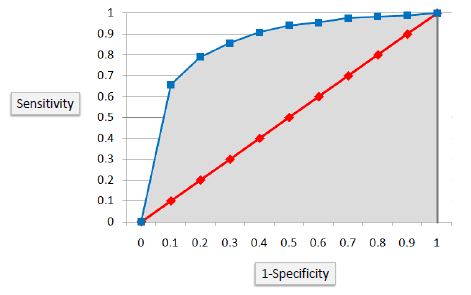
The ROC chart is plotted with :
- Y axis as sensitivity [True Positive Rate] and
- X axis as (1-specificity) [False Positive Rate]
The diagonal line represents a random chance model whereas the line curved towards top left represents how better the model is. The more distant the curve, from the random chance line, the better is the model.
AUC : The area under the curve is also used as a quality measure. A random classifier has an area under the curve of 0.5, while AUC for a perfect classifier is equal to 1
c = (%concordant - %discordant + %tied) ÷ no of pairs
(random chance) 0.5 < c-stat < 1 (perfect model)
Other Techniques
K-S Chart

K-S is a measure of the degree of separation between the positive and negative distributions (events vs non events). It is defined as the maximum difference between cumulative % event and cumulative % non event.
The K-S is 100 if the scores partition the population into two separate groups in which one group contains all the positives and the other all the negatives. If the model selects cases randomly from the population, the K-S would be 0.
KS Statistic is the measure of maximum separability.
(random chance) 0 < K-S < 100 (perfect model)
Gain and Lift Charts
Gain is defined as the cumulative % of target (the ratio of cumulative number of targets (events), to the total number of targets (events))
Lift measures how much better one can expect to do with the predictive model comparing without a model. It is the ratio of gain % to the random expectation % at a given decile level. The random expectation at the xth decile is x%.
- Score (predicted probability) the validation sample using the response model under consideration.
- Rank the scored file, in descending order by estimated probability
- Split the ranked file into 10 sections (deciles)
Rank Ordering
Same deciles table is created and % of Events is checked to see if there is any discrepancy in downward trend. If the trend is broken then the rank ordering is not maintained.
Concordance
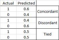
- Concordant Pair
- Discordant Pair
- Tied Pair
Percent Concordant = (Number of concordant pairs) / Total number of pairs
Percent Discordance = (Number of discordant pairs) / Total number of pairs
Percent Tied = (Number of tied pairs) / Total number of pairs
Area under curve (c statistics) = Percent Concordant + (0.5 * Percent Tied)
Hosmer and Lemeshow Goodness of Fit
It is carried out to check if the regression explains the variance in data. It sorts the predicted values and groups them into 10 deciles and compares it against the sorted and grouped dependent variable in the original dataset and finds out if any significant difference between observed and expected.
Chi sq. test for difference between observed and expected. High p-value indicates good fit.
H0 : The data are consistent with a specified distribution.
HA : The data are not consistent with a specified distribution.
AIC [Akaike Information Criterion]
By adding more parameters, better fit is obtained. However, after a certain point, model tends to overfit.
AIC captures tradeoff between number of parameters added and the incremental amount of error.
Basically, it penalizes models for overfitting of data. Also known as loss criterion.
Model with lower AIC is better !
AIC = - ln L + p L = likelihood p = parameters
AIC = N ln (SSerror ÷ N) + 2K N = no of obs K = no of parameters fit+1
BIC [Bayesian Information Criterion]
BIC penalizes the number of parameters more than AIC. Emphasizes simplicity of model.
Gini (Somers’ D)
Determines the strength and direction of relationships between pairs of variables.
It ranges from -1 (all pairs disagree) to +1 (all pairs agree). Should be gt 0.4
Somer’s D = 2 AUC - 1 = (%concordant - %discordant) / 100 = (Concordant pairs - Discordant pairs ) / Total Pairs
Gamma
Similar to Somers’ D but does not penalize for tied pairs.